Code211
October 2017 - November 2017
Code211: District 211’s Flagship Hackathon
I was tasked with creating a website for a Hackathon I was helping create called Code211 for Township High School District 211. The event was created to help get high school students involved in the world of programming, hoping to bring in everyone from beginners to experienced coders to this massive programming event. This was the second Hackathon I was creating the website for, so some of the solutions/designs I used were very reminiscent of the site I created for Chicago Hacks.
Building the Theme of Code211
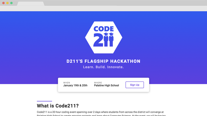
The district consisted of 5 high schools, all with very distinct and different school colors. Since this was a district wide event, we were including all high schools in this event, and as a result I wanted to pick a color that didn’t represent any of the schools for our website’s color palette.
I ended up picking purple as the accent color of our site, with most of the sites components being accented in purple. I used a blue to purple gradient in a lot of elements on our site to help give the design more depth.
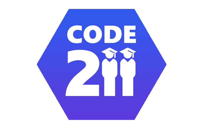
Designing the Logo
For the event, a logo was needed to help build an identity. I wanted a very basic and minimalistic logo that would be practical for a t-shirt and other print materials. I ended up using a hexagon as the base of our logo, and then added the word “Code” and “211” to the inside of the logo. The “211” was our District’s logo, hoping to remind visitors that this was being run by the high school district.
Designing the Poster
We needed to advertise this event to people, so naturally there needed to be a poster to hang up all around the school to help advertise the event. I wanted to create a poster that would grab the attention of experienced programmers and people who knew nothing about programming. So we went for a style that would appeal to everyone by putting a call to action on the top, followed by more information about the event.
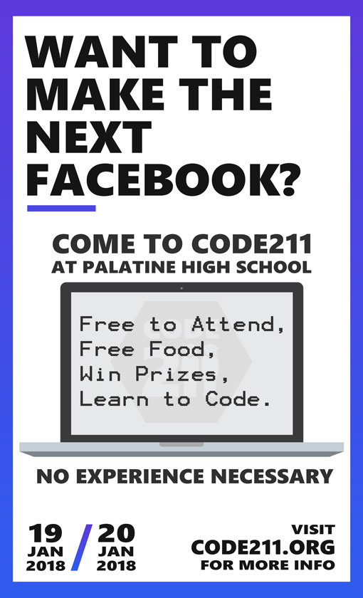
The poster was mostly white in an attempt to make it very printer friendly. I used the bold Segoe font to bring a lot of attention to the text. The poster followed our color scheme, with multiple blue to purple gradients implemented in the design to help build brand identity. I went for a flat design, but instead of the primary secondary color scheme that most flat designs use, I just stuck to neutral colors and one gradient for accents.
The poster was largely informational, I felt like the reader would need to be instantly informed on what the event was to keep their interest. The word Hackathon is definitely not well known among high school students.
Finding the Perfect Typeface
The most important part of a site is the readability of text, and I wanted to make sure I kept a modern look for our site, because, well, a programming event should emanate a modern feel.
I kept the width of text boxes to a maximum of 800px to keep the readability of the text. Lines that are too wide are hard to follow and can lead the reader to get lost.
The font I ended up using was a sans serif font called Roboto, which is famously used by Google in things such as their popular operating system, Android. It is a familiar font, which only adds to the readability of the font. The more familiar a user is with a font, the more comfortable they are with it, leading to easier and faster reading.
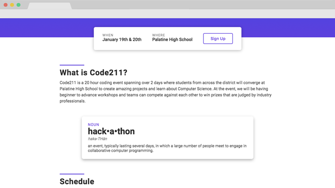
Creating the Dynamic Schedule
One of the biggest challenges was displaying the two day schedule in the most dynamic and readable way possible. There is a lot of events, and displaying both days on the page list style would make it unwieldy and long.
To solve this problem I opted for a tab system to display the images.
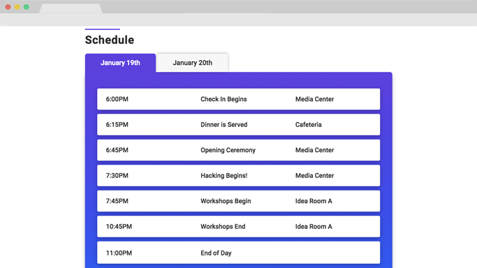
I used the blue to purple gradient in this element also, having it subtly fade from purple to blue in the background. It is the small details that make the difference :)
This tabular system was efficient in displaying the two days, in that it cut the space used in half by showing one day at a time. You are able to click on either of the tabs to choose which day’s schedule you wanted to see. I used some JavaScript functions to help us create this interactive tab system.
The Grids of the Site
There are two grids on the site, the grid with the FAQ’s and the grid with the School Representatives. They both contain fade up animations when you scroll down.
I used the gradient on this page also, and then used box shadows and fading animations to really make these boxes pop.
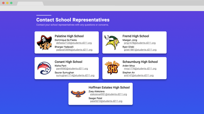
The key in these grid systems was to make sure they did not blend in with the background of the webpage, so I added some subtle box shadows to make them pop from the background.
The Mobile View
Our target audience was high school students, a generation known for using mobile devices. So I needed to make sure our site looked great on mobile also, and honestly, it is 2017, so a mobile optimized site is almost a requirement at this point.
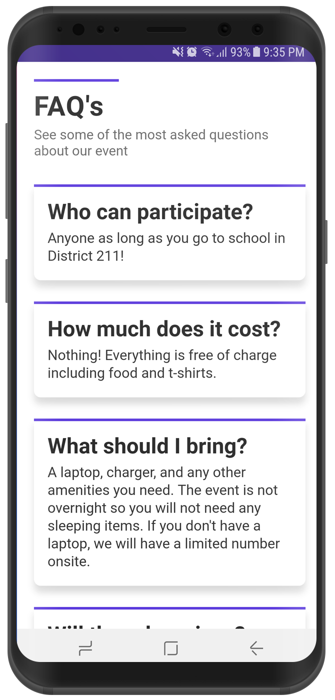
I made sure the viewport scaled all the way down to 320px of width, which is about the smallest screen you can find these days. I made sure I did not remove any elements, I wanted the website’s experience to be the same on a phone as on a laptop.
Conclusion
This site was very similar to what I made for Chicago Hacks, and as a result the structure was very similar, but this project definitely made better use of the space. The page for Code211 was not nearly as long as my last Hackathon website. One thing I had not really considered until this project was how long one page websites should be, and this project definitely made me think about how to solve the mile long page problem.